Creating responsive tables with flexbox

One of the most promising developments in CSS recently has been the flexbox display option. Ever since bootstrap hit the scene, grid layout platforms have all but superseded the old ways of designing page layouts. We've come a long way since the dark ages of table layouts.
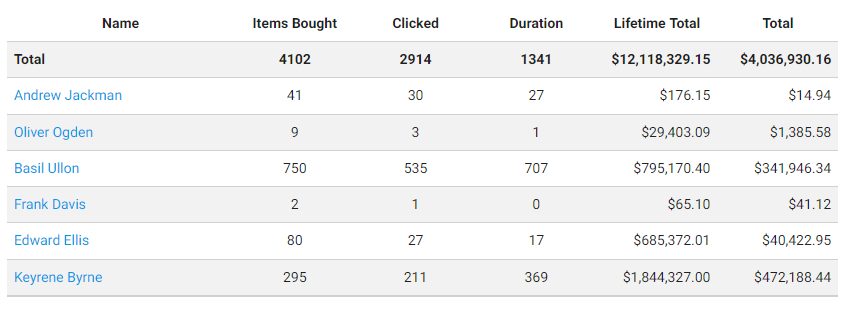
Flexbox allows you to specify row and columns. Because of these similarities to tables, I had the idea to see what a pure flexbox table would look like.
It worked surprisingly well. With a bit of CSS, you can emulate the features of a plain old HTML table with a lot more flexibility. Since you have complete control over the presentation logic of each type of element (tr, th, td, ...), you can change each part to have fixed positioning, kill overflow, and have variable length columns without colspan hacks.
